essie nail polish
Art Direction / Layout Design / Print / POS
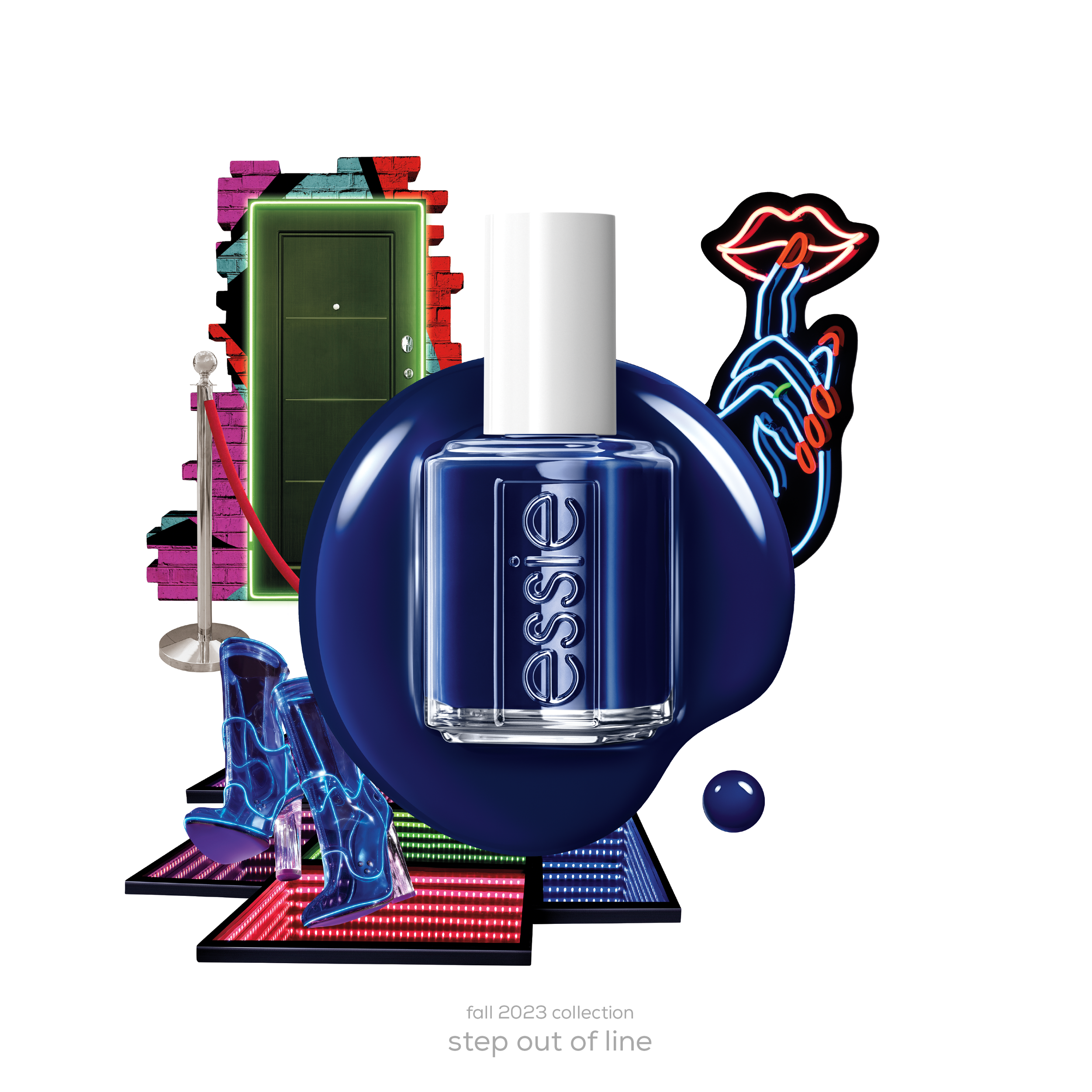
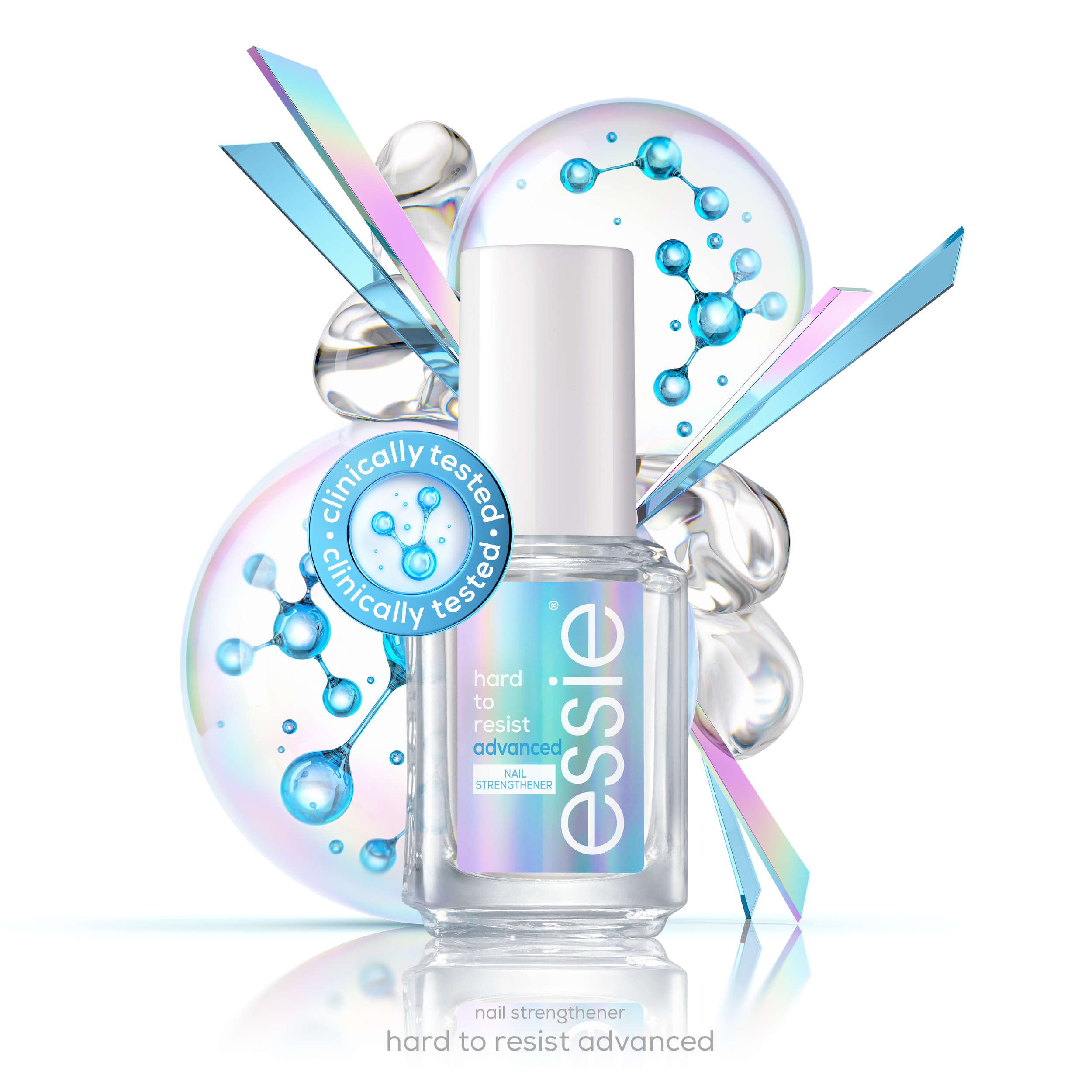
Essie is an international nail polish brand that has thousands of colors to choose from. For their seasonal color collections, I designed a series of print ads that transformed each palette into a world of its own. Through trend research, mood boards, and rounds of refinement, I built visual narratives that captured the brand’s playful tone and the emotional impact of color.


The process.
Every visual you see above is the result of hundreds of iterations, carefully crafted mood boards, and multiple rounds of client presentations. Here's a look behind the scenes at my creative process.
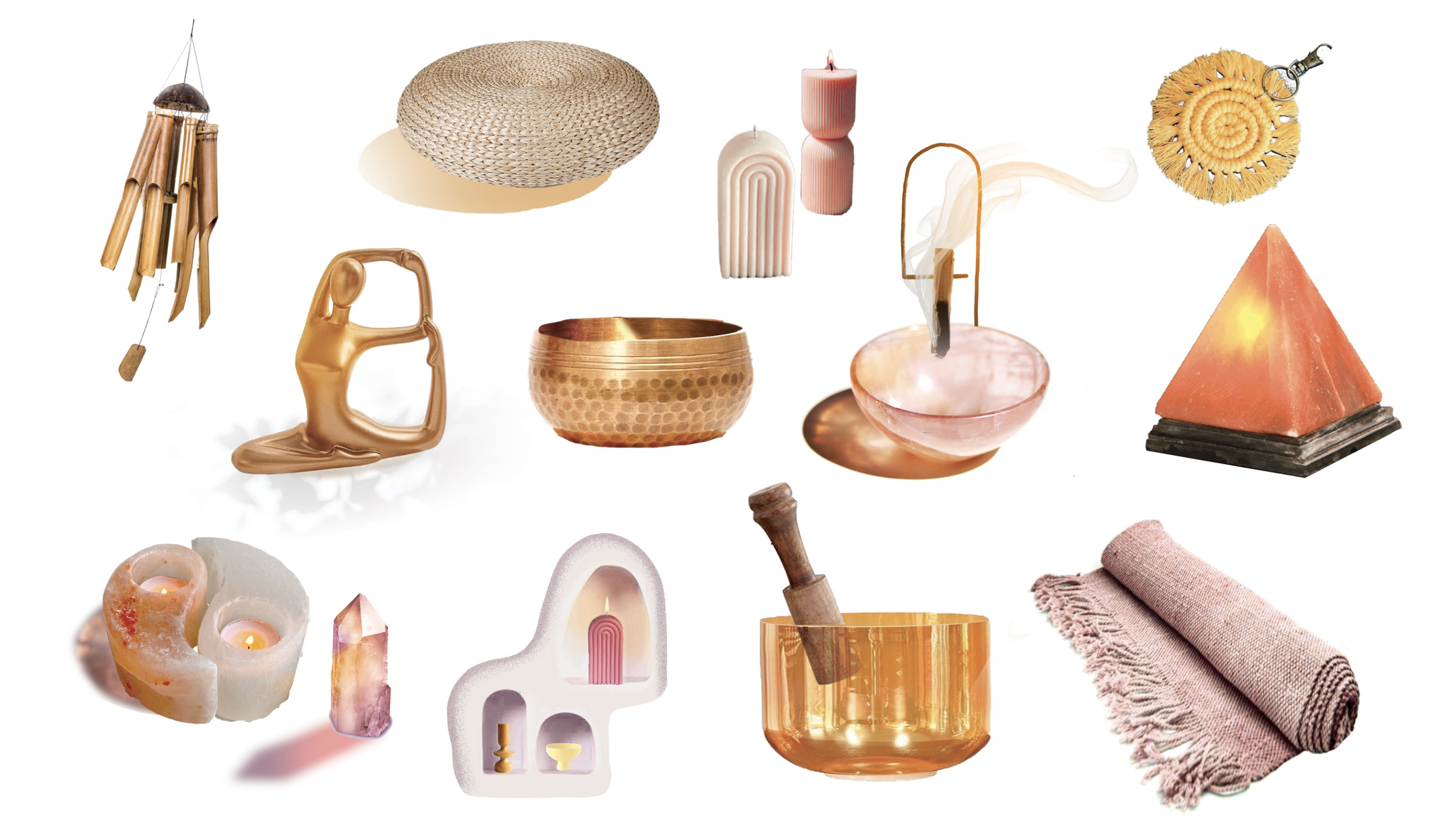
Visual Direction
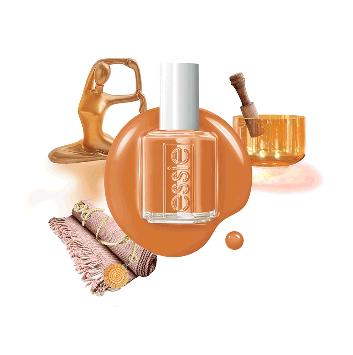
I built out a world rooted in desert textures and rituals: pulling from adobe forms, salt, woven fibers, and sound healing objects. The prop direction focused on warm, tactile materials and soft lighting techniques.
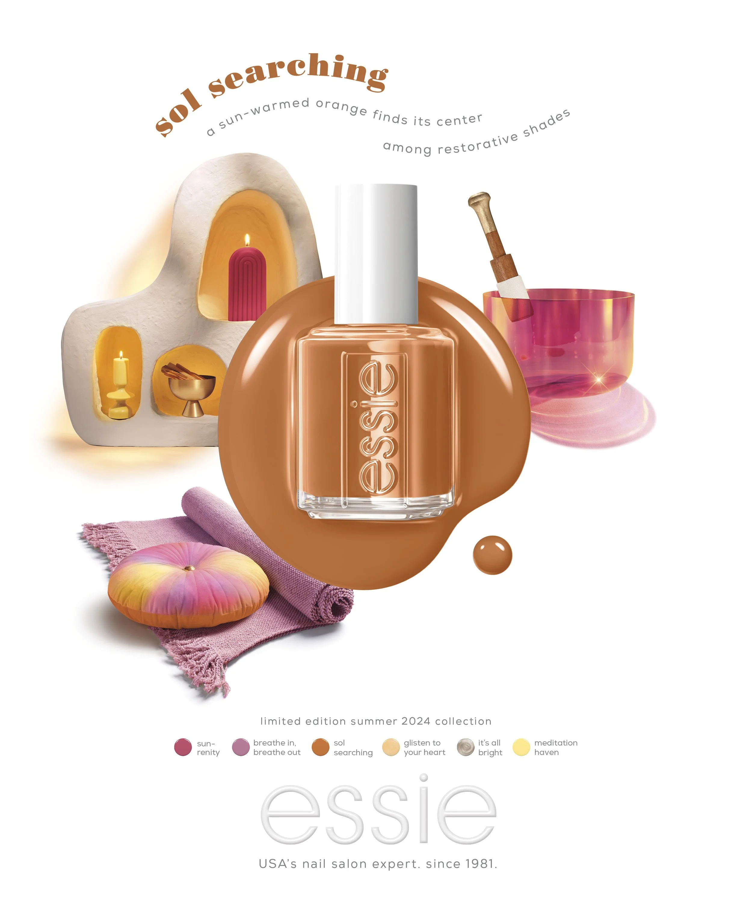
Concept and Color Story
Inspired by a palette of sun-warmed neutrals and soft, restorative tones, this collection explored a more grounded, introspective take on summer. Shades like Sol Searching, Meditation Haven, and Breathe In, Breathe Out set the tone for something calm, warm, and centered.
Execution
I led the photoshoot direction, focusing on composition, material contrast, and lighting. Through diffused, warm light and intentional object placement, the scenes highlight the play between reflective and matte surfaces while maintaining a calm, balanced visual tone.